
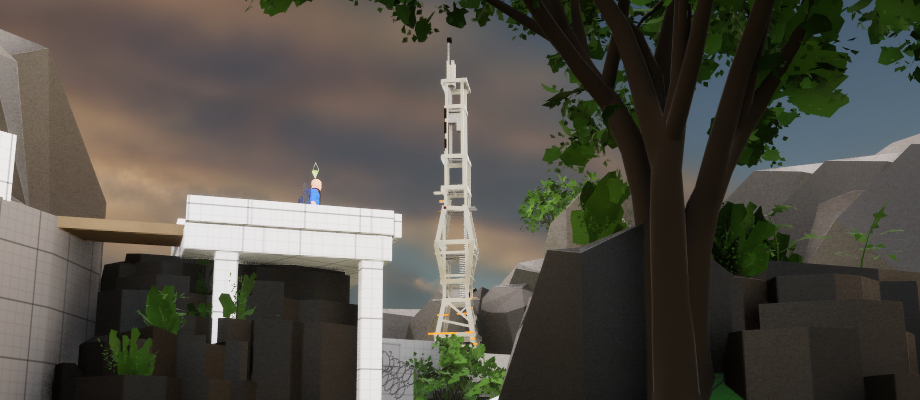
Harbour
Tactical multiplayer FPS
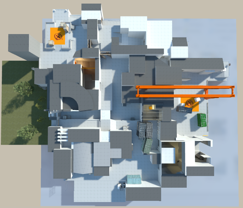
Overview
Process
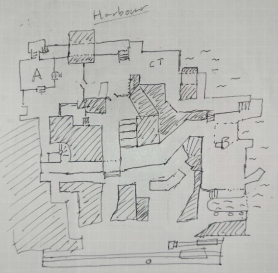
Pen and Paper
I started out making this level with pen and paper. With experience in Counter-Strike 2, I could easily imagine what lineups would cause a problem and how a player would tackle both attacking and defending a site.
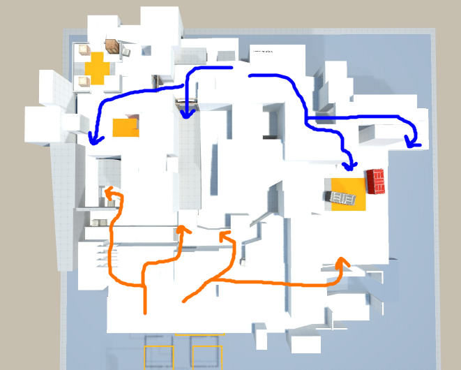
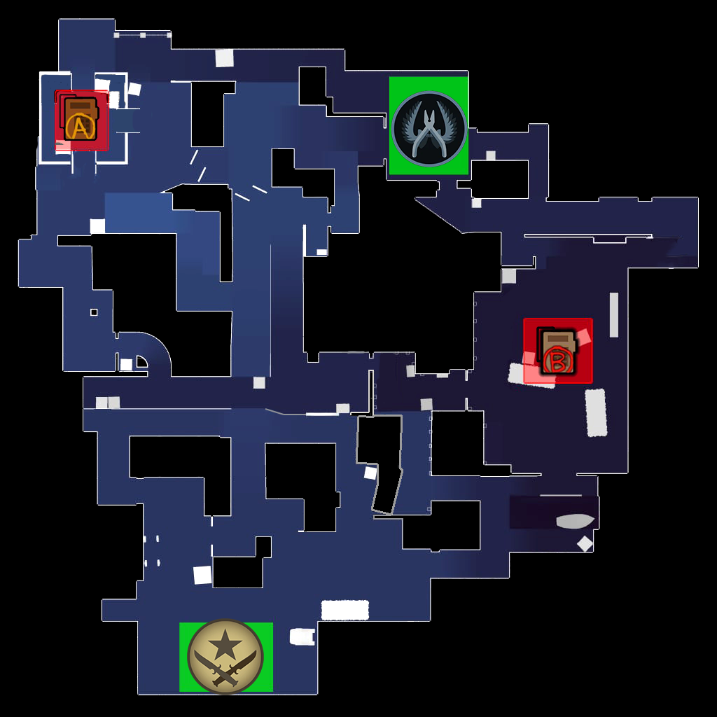
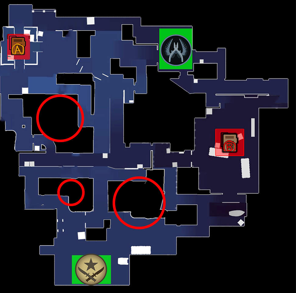
This layout was specifically inspired by the clover design pattern.
Clover Design
The clover design (in the red) is a pattern to create rotations that different maps use in Counter-Strike. Combat resides on the corners and intersections of the square.
The green represents an approximate area where combat resides for this pattern to work. All corridors lead into these areas with a chokepoint, creating room for the players to influence by defending the area.
Understanding Hammer
The biggest challenge for me in the pre-prod was to understand the spacing of counterstrike since a lot of the layout comes down to how long it takes to rotate to different areas. The switch from metric to imperial system was also a bit of a learning curve. (Did you know most maps in counterstrike are about 4000×4000 units wide?)
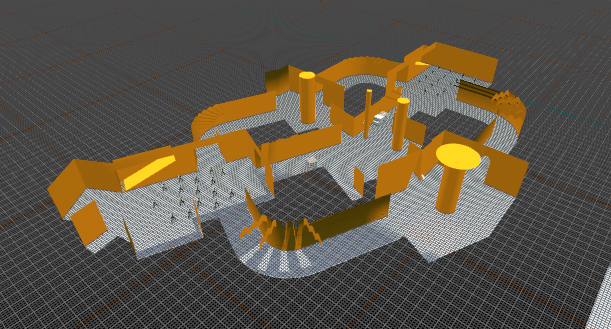
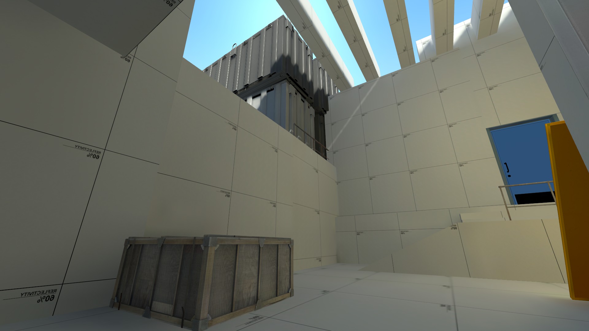
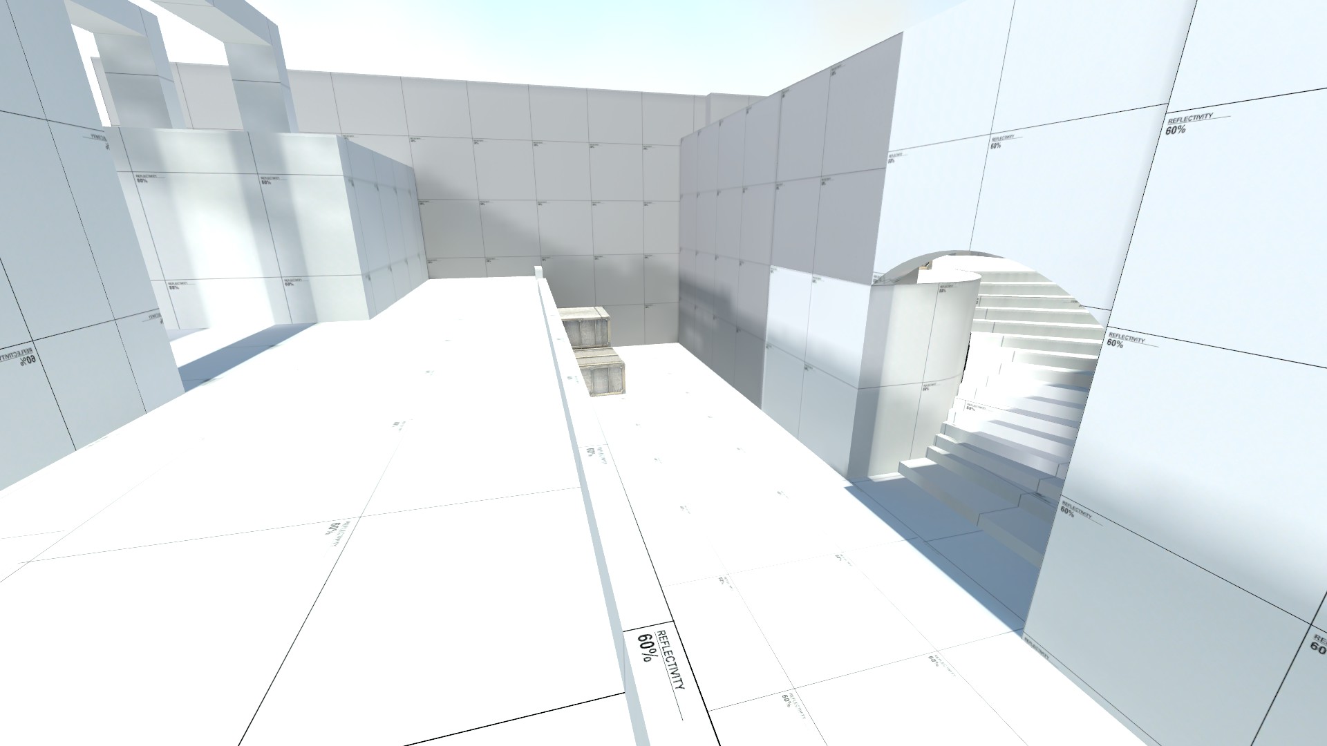
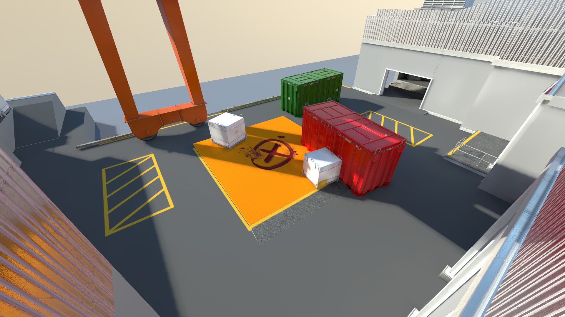
Blockout
The map was taken into a prototype stage that could be played early on.
Doing this during the blockout stage allowed me to quickly change parts of the layout and points of engagement for balance.
Blockout Process
When creating the blockout I focused heavily on the timing when both teams sprint towards an area.
Measuring timing early on creates an understanding of where the point of engagement resides.
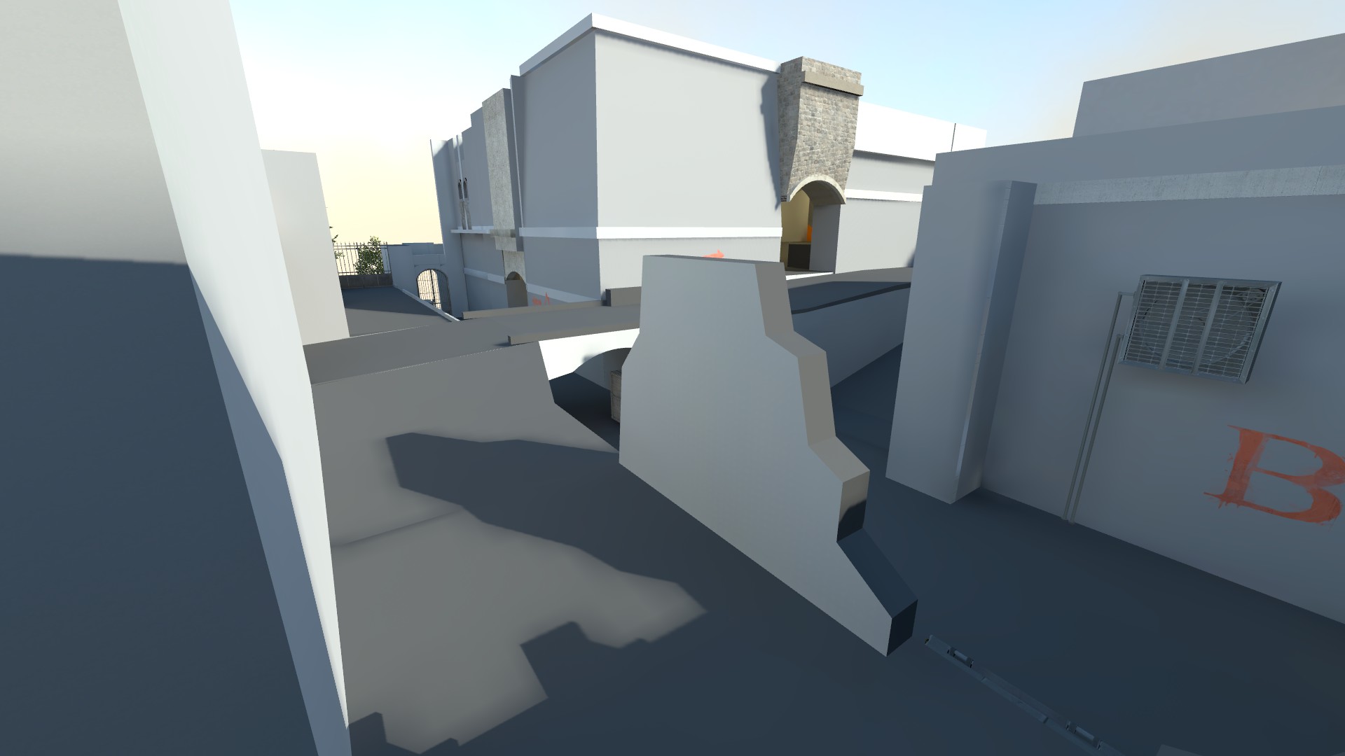
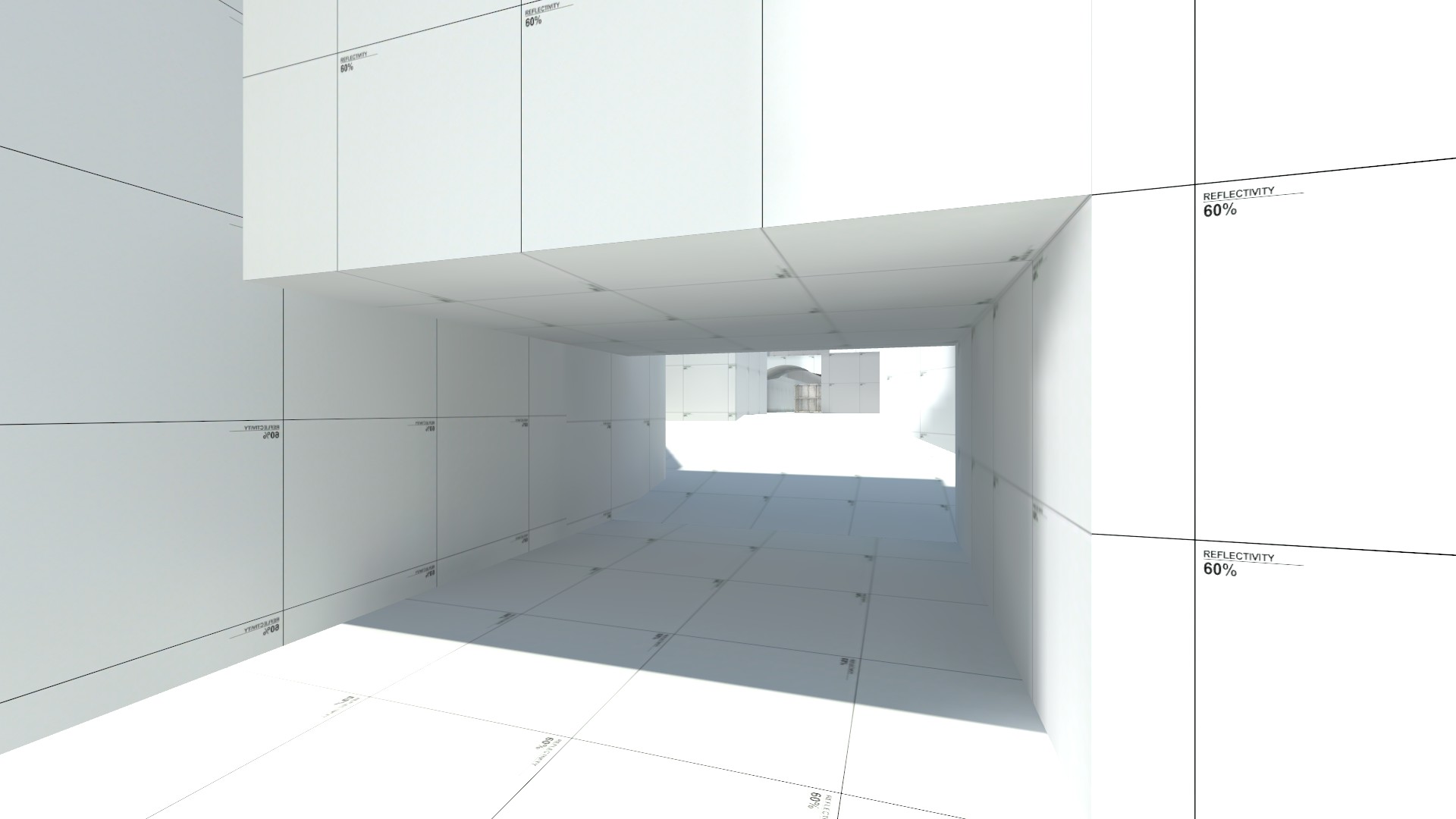
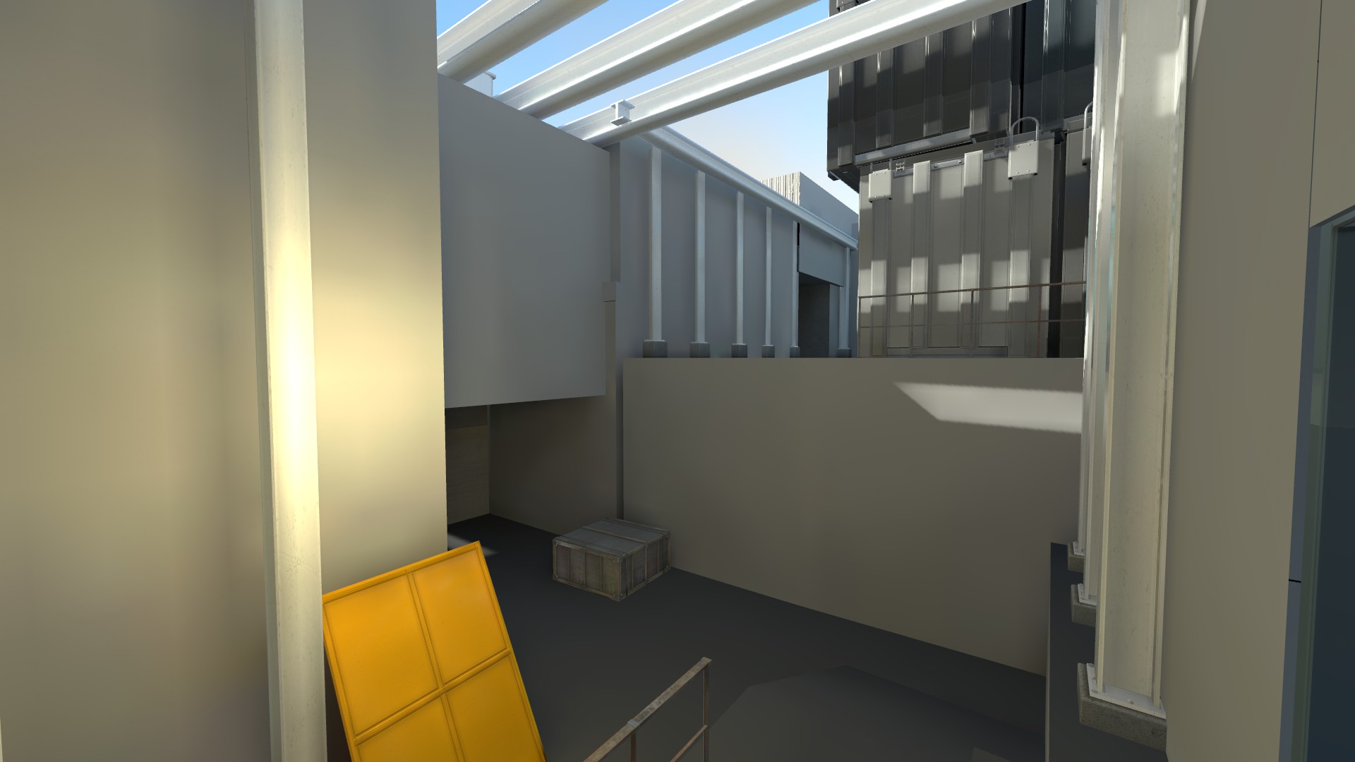
Long corridors
One of the most memorable flaws in the blockout was a long line of sight from B-site to the middle.
While playtesting I came to the conclusion that a line of sight from the B-site to the other end of the map would tear down the entire concept of the map.
Playtesting
In the playtesting stage, I got a lot of feedback on the map. Both positive and negative. Players often tended to call the map fun, and that it felt like Counter-Strike. They could’nt break the map and kept focus on the strategy.
Feeling like counter-strike
The map played out as intended and the flaws revealed themselves in the philosophy of Counter-Strike rather than in the metrics.
In hindsight, I am very happy that I managed to create the same feeling as counter-strike 2.
Powerful lineups
At times I realised that the map had lineups that where too powerful. These sort of deviations was easy to spot and easy to fix. The harder part of the feedback comes with the next session.
Negative Space
In Counter-strike negative space is all about the gaps between the playable area. In this case it revolves around that there is not enough gaps in between areas to influence.
This negative space is what creates a slower pace when playing. It is the uncertainty of “can there be an enemy here right now?”
Solving The negative Space
A way to solve this is to broaden the map and create more room for engaging at a slower pace in certain areas to influence.
The distance created would help the map out. I would love to do some more playtesting on this in the future, however I do not believe that this change alone would make the map good enough to get into any map pool.
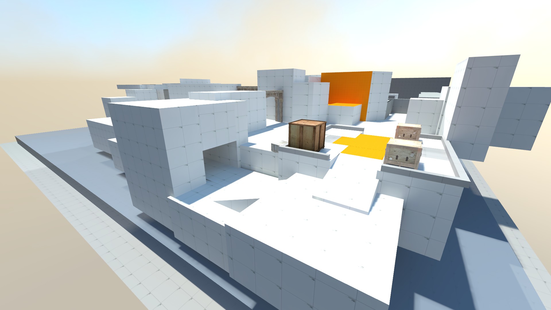
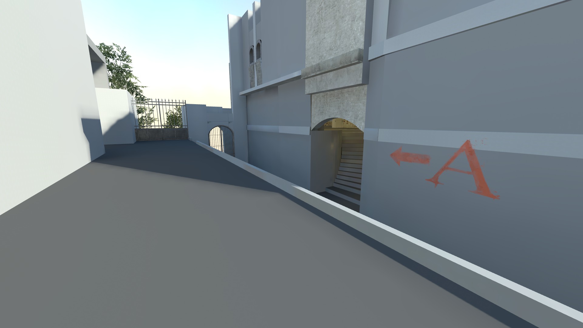
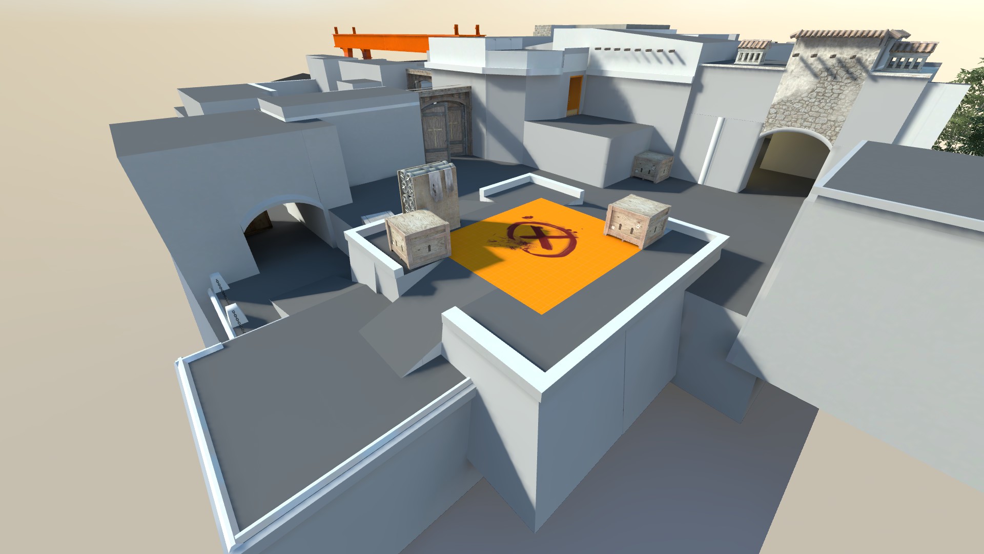
Final Touches
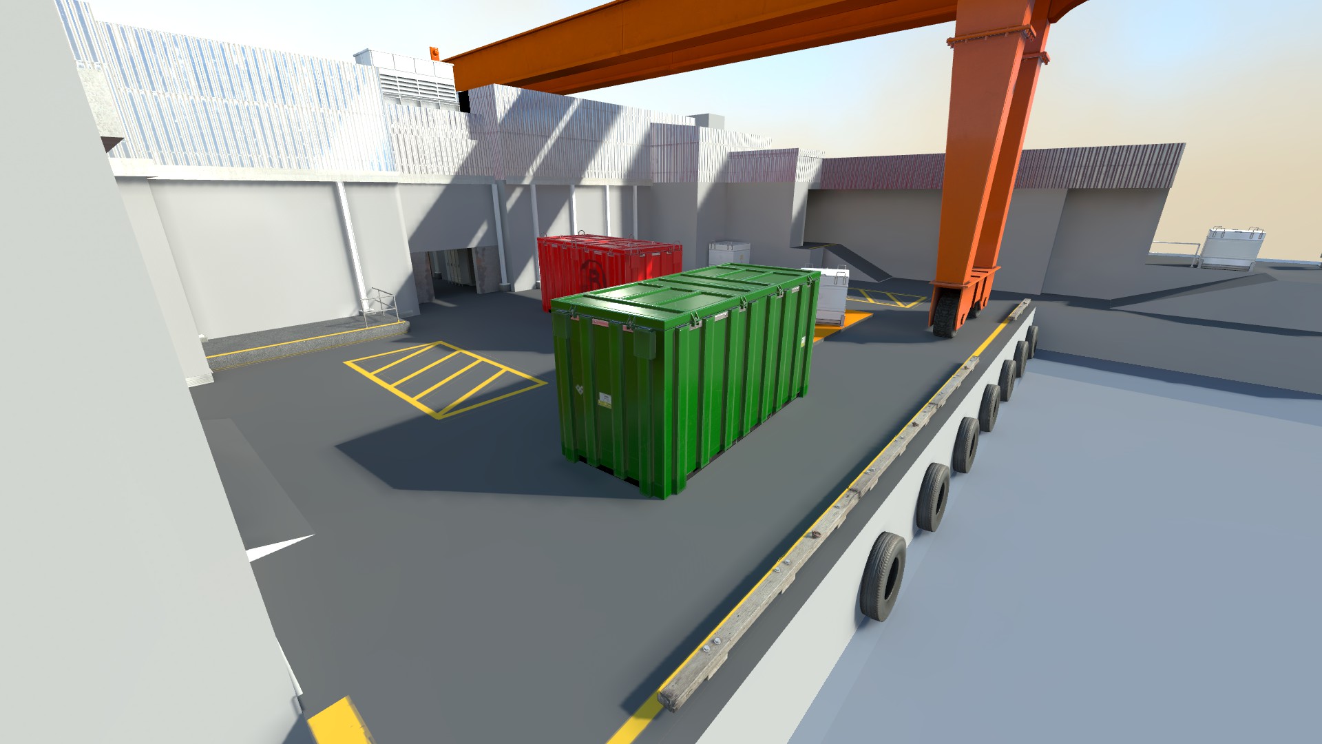
After playtesting I returned to the map to create a whitebox which included all the fixes for the level. I also textured the areas to create an easily readable space.

Closing Thoughts
The goal of this project was to understand what made multiplayer in counterstrike recognizable and add a map with a new take on the core concept. If the map got into the game as a level in the core map pool, it would be considered similar to older maps but with fresh lineups and different rotations.
The comment “it feels like counterstrike” is something that signify that angles and metrics matches the core of the game, which is the result of hard iteration at the early stages. The next stage would be to decorate it and keep playtesting since maps of counterstrike always keep evolving.
Other Pieces
Ilyads Last Stand
Counter-Strike 2
Competetive 5v5 map for counter strike, made in hammer and playtested by Mapcore.
Shipyard
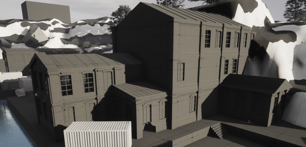
Action RPG
Slash your way through the jungle and lay waste to the maiciousness within.